
The screen on a phone
Two bands of controls float over the conversation: everything above it in
#overhead, everything below it in #underfoot. The text scrolls underneath
both and fades out into them.
Why you would use it
This is what you are looking at. Knowing which row is which makes the rest of the docs findable: "the mode strip", "the plan strip", "the status bar" all name a row in one of these two bands.
How to use it
Nothing to operate. What sits where, top to bottom:
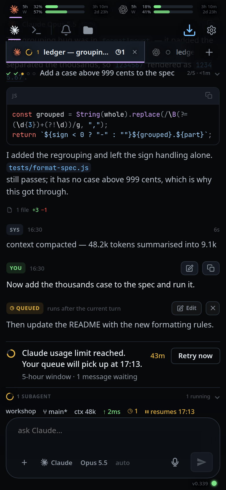
#overhead — the top band.
- The usage meters (
#agents). - The mode strip (
.modestrip): Agent and Shell (#send-modes), Notify, the folder button (#files-open), then Install (#install) and the cog (#settings-open) at the right edge. - The top bar (
.topbar): the tab strip (#tabstrip), the new-thread plus (#new-tab) right after the last tab, and the update-ready arrow (#update-ready, only while an update is waiting). - The plan strip (
#planstrip), when the agent has steps to show.
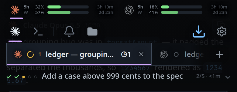
#underfoot — the bottom band.
- The offline banner
(
#offline-banner). - The two-row shell keypad (
#tray-keys), while Shell mode is selected. - The subagents strip (
#subs). - The status bar (
#statusbar). - The slash menu (
#slashmenu) and the attachment row (#drafts). - The composer (
.composer): agent, model and effort pickers, attach, the composer (#draft), mic, steer and send. - The version row (
.app-version): the app's build, writtenv0.253, and right of it the connection dot (#link-dot).
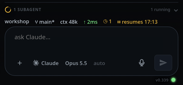
The conversation (#thread) fills the space between them; in
shell mode the pane (#panel) fills the same slot. From 760px
up both are a pane's instead, in #panes between the bands — see
wide-layout.
What you see
- One dark app. There is no light mode and no theme setting —
color-schemeisdarkand the palette is fixed in:root. - Each band is a single fade: 75% dark where the innermost row meets the text, solid at the far edge. No row has a background of its own, so there is no step or seam between rows.
- Text and icons on the bands carry a dark halo so they stay readable against the conversation showing through.
- The bands do not take taps except on their controls: text visible through a fade is still tappable.
- Sheets and popups cover the bands. The toast (
#toast) sits centred just below the top band, shows a check for success and a cross for failure, hides after 3.2 seconds, and a tap dismisses it. - The frame fills the window at every width. From 760px up it is also scaled up and the rows in the bottom band are capped at a reading width. The top band is one 48px row there. Agent and Shell move into each pane's header. See wide-layout.
Limits and known gaps
- No theme, no light mode, no font size setting.
- Colour is reserved for meaning — status, diffs, links. Selection is shown with elevation and a violet bar, not with a coloured border.
- The new-thread page hides the bottom band; the conversation keeps its padding so nothing jumps when you swipe back.
Related
- wide-layout — what changes on a wider screen
- icon-legend — every mark in these rows
- toasts — when the app says something and when it stays quiet
- status-bar — every segment of the row above the composer
- plan-strip — the row that appears when the agent has steps
- read-the-transcript — the conversation these bands float over