
The layout on a tablet or desktop
Given a wide enough window the frame fills it, the whole app is scaled up, the conversation moves into a pane with a header of its own, and the file explorer stops being a drawer and stands as a column beside it.
Why you would use it
The app is built for a phone, where the explorer is a gesture and the type is sized for a screen held at arm's length. On a laptop that reads small and wastes room: you want the files always visible, tabs you can click and close from, and lines of text short enough to read back to their start. And with the room for two conversations side by side, each one needs its own tabs and its own buttons.
How to use it
Nothing to turn on. Resize the window, or open the app on a wider screen.
The frame fills whatever width the window has, at every size. From 760px wide it is also scaled up 1.1 times, so the phone's type sizes read on a desktop screen.
From 760px the conversation sits in a pane (
.pane) with a header of its own (.pane-head), and the top of the screen is one 48px row: the usage meters on the left, then Install, the update arrow, Notify, the folder (#files-open) and the cog (#settings-open) at the right end. The version and the connection dot (#link-dot) sit once at the bottom right, in a grey bar across the foot of the window, not under each pane's composer. The phone's tab strip (#tabstrip), plus (#new-tab) and Agent and Shell chips (#send-modes) are not shown: each pane header carries its own. The two-row keypad stays in the bottom band for the focused pane while it is in Shell mode.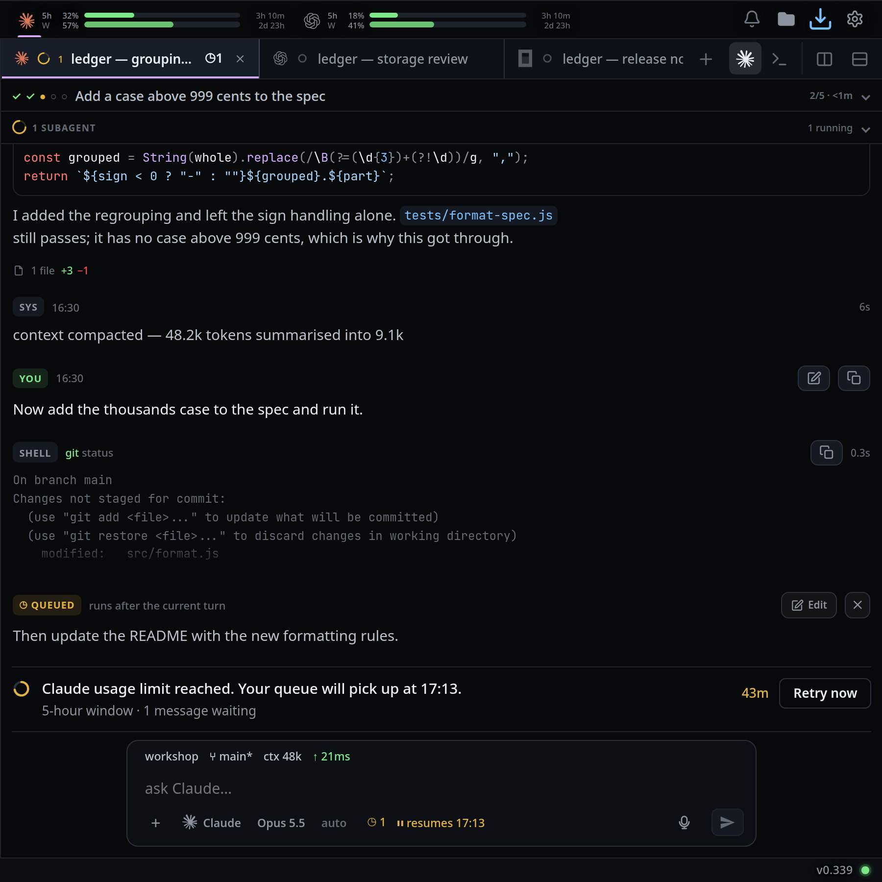
The pane header holds, left to right: the pane's tabs (
.pane-tabs), the plus (data-act="new-tab"), then at the right end Agent and Shell for this pane (.pane-modes), Split right and Split down, Zoom pane and Close pane. With one pane the zoom and the close are not shown, and neither is the focus ring.The tabs in a pane header are a desktop tab bar: each one a rectangle the full height of the header, meeting the next one on a hairline, the tab you are in filled, edged down both sides and underlined in its colour, a close cross on it and on whichever tab the pointer is over, and a mouse wheel over the strip scrolls it sideways. The first tab starts at the pane's own edge, in every pane: the resize handle of the line on the left straddles that line rather than leaning into the pane. That tab draws no edge of its own on that side, the pane's line being it, so the ring of the pane you are in meets the tab in the pane next door across one hairline. See close-and-reopen-tabs.

Click Split right or Split down in a pane header, or press Ctrl+D or Ctrl+Shift+D, to put a second pane beside or under it. Up to six across and six down. Each pane keeps its own tabs, its own mode and its own header; the focused one is the one the composer, the status bar and the explorer follow, and it wears a violet ring.
From 1080px the file explorer docks as a column on the right (
#explorer), 280px of the frame's own, 308px on screen. Its rows are VS Code's there — 22px tall, 16px icon and chevron columns, 8px of indent a level — rather than the phone's thumb-sized ones.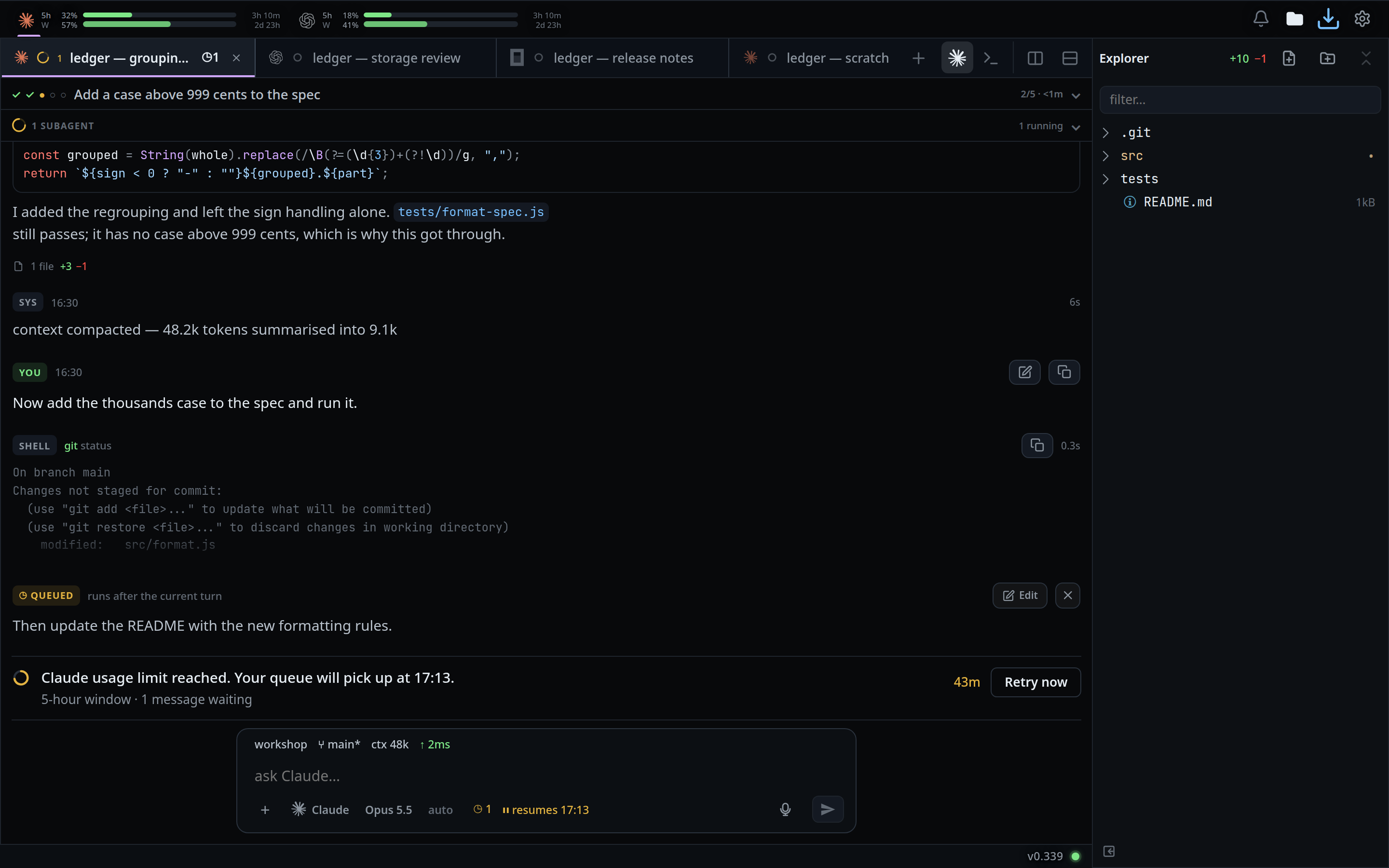
Click the folder button next to Notify (
#files-open) to hide and show the explorer column, or click the small panel-close icon at the bottom-left of the explorer (#explorer-toggle) to hide it. Hidden, the column leaves a slim 28px rail at the frame's right edge (#explorer-rail); click anywhere on it to show the column again. The choice is remembered on this browser.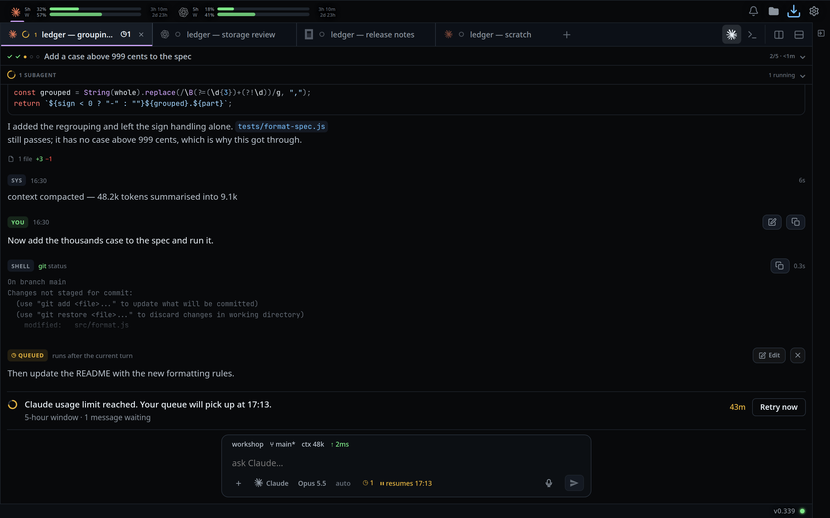
Below 1080px the same button opens the explorer as an overlay instead, from the button or the right edge.
What you see
- Each pane's Agent and Shell pair is that pane's own. Moving the focus to another pane puts the composer back in the mode that pane was left in, and a pane in shell mode shows its shell inside its own box, under its header, while the other panes show their conversations. See agent-or-shell-mode.
- The docked explorer has no scrim, no slide and no animation: it is furniture. Hidden, it leaves a slim rail where the column stood, so the files stay one tap away.
- The tab drawer is still a drawer at every width. It is pulled in from the left edge with a finger, and there is no column version of it any more.
- The composer is capped at 584px of the frame's own (642px on screen) and centred, and so is everything stacked above it in the bottom band: the status bar, the subagents strip, the attachment row, the key tray and the menu the slash menu and the agent, model and effort pickers open. They all start and stop where the box does. In a pane the status bar and the subagents strip are not in that stack — the strip is a header row at the pane's full width, and the status bar rides inside the box. The menu and the key tray carry the box's edge and corner rather than a line across the window. Every pane caps its own footer the same way, so a box is the same width whether one pane is open or four. A pane narrower than the cap gives its box the pane's width. A pane's footer is the box and the attachment row above it, and nothing else: the subagents strip is a header row under the pane's plan, and the status bar is drawn inside the box: the machine, branch, context and ping on a row above the words, what is waiting in the key row. The transcript scrolls under the box at its sides, unfaded — the box carries its own surface, so the text either side of it stays readable.
- The composer keeps the phone's shape — the entry, then the
+, the agent, model and effort buttons, the mic and send in the row under it — with one row added above the entry for the machine, branch, context and ping, and the row of keys is shorter, since a pointer hits a smaller key than a thumb: 13.75px in the entry, a 25px row of keys, a 30×25px send key, the agent, model and effort chips at 10.5px, and the rows of the slash menu and the chips of the attachment row brought down with them. The whole box is 69px of the frame's own, 76px on the screen. Every one of those is a frame px, and the frame is zoomed 1.1 times, so the entry reads at about 15px on the screen. The dashed box a pane without the composer shows is scaled with it, so the footers of four panes still line up. - The box opens at one line rather than the phone's two, and grows as you type, to seven and a half lines and no further — a fixed ceiling, where the phone has only a share of whatever the box stands in. The share is still there under it: a box in a pane shorter than about 450px stops at a third of the pane before it reaches that. Past it the message scrolls inside the box. Emptying it takes it back to one. A phone holds two lines open because a thumb writes into a box it cannot see past; a keyboard does not need them, and four panes each holding two spare lines is most of the floor of the window.
- The transcript is not capped: the text uses the whole column, and the scroller keeps the full width, so the wheel works anywhere in it and the scrollbar stays at its edge. The row on top and the shell pane are not capped either.
- Scrollbars are thicker than the phone's: a 10px track with a 6px thumb that lightens under the pointer, in place of the 3px hairline a finger never grabs at. The strips that scroll sideways — a pane's tabs, the mode strip, the subagents strip and the status bar — still show no bar at all.
- The transcript, the composer, the plan strip, the status bar, every sheet and every popup stop at the explorer's column, so a file you open appears beside the explorer rather than over it.
- The toast and the jump-to-latest arrow centre on the space left of the explorer, not on the window.
- Rows in the explorer light up under a mouse pointer.
- While the explorer is a column, the folder button is a switch and lights up when the column is showing.
- Below 760px nothing differs from the phone layout.
Options and settings
| Option | Default | What it changes |
|---|---|---|
| Wide width threshold | 760px | Below it, the phone layout |
| Explorer width threshold | 1080px | Below it, the explorer is a drawer |
| Frame zoom | 1.1 | --zoom, applied by the zoomed class on #frame |
| Bottom band width | 584px of the frame's own | --compose-w |
| Explorer column width | 280px of the frame's own | --dock-r |
| Hidden explorer rail width | 28px of the frame's own | --dock-r under files-rail |
localStorage wb.files.hidden |
absent | '1' hides the explorer column. Absent means shown |
Limits and known gaps
- Only the explorer can be hidden, and only while it could be docked: clicking the folder button below 1080px opens the drawer and writes nothing, so a later wide window does not come up with a column already hidden.
- The hide is per browser, not per account.
- In private browsing,
localStoragethrows; the layout still works, and the hide simply does not stick. - The zoom is switched on, measured, and taken back off on a browser that zooms the layout but still reports rects unzoomed — Safari before 26.4. There the layout is the wide one at the phone's type sizes.
- A docked panel refuses the edge gesture and ignores
open()andclose(), so the back button never tries to close it. - The widths, the zoom and the reading width are fixed. There is no drag handle and no setting.
- Between 760px and 1080px — a tablet in portrait — the frame is wide and the explorer is still a drawer.
- Six panes across and six down at most, and they share one file explorer column
and one shell session. A split past that says
6 panes across at most. - The pane layout is remembered per browser in
localStoragewb.panes; the per-pane Agent and Shell choice is not, and a reload comes back in one mode.
Related
- split-panes — splitting the wide window into panes, six across and six down
- floating-chrome — the same chrome on a phone
- icon-legend — what the folder button and the rest mean
- switch-tabs — the strip that becomes each pane's tabs
- agent-or-shell-mode — the pair in every pane header
- shell-mode — the shell inside one pane
- close-and-reopen-tabs — the cross on a tab
- tab-drawer — the left drawer, a gesture at every width
- file-explorer — the right panel and what it lists
- back-button — what the back button closes when nothing is docked
- type-to-start-a-message — typing into the pane the keyboard selected
- toasts — the card that follows the column